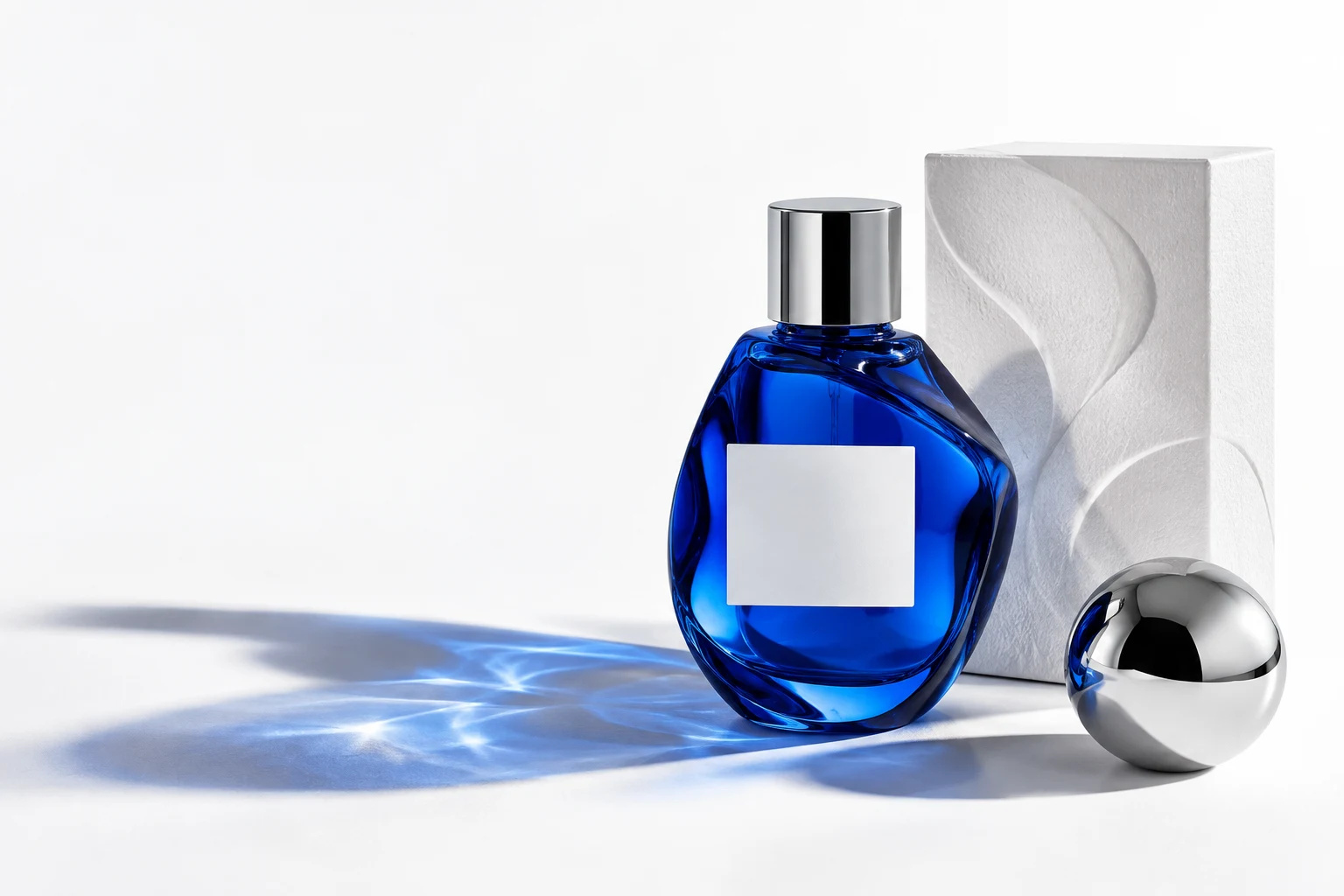
AI can help develop an imagined product scene or a coordinated campaign look. It still needs art direction. A useful brief explains what the image must communicate, how the product should appear and where the final asset will be used. It also defines what needs to be checked before publication.
Begin with the purpose and placement
Is the image a website hero, a social post, an ad or a presentation visual? Give the intended size, crop and any space needed for copy. A scene that looks excellent as a square may lose its subject in a narrow banner.
Describe the audience and the desired impression in concrete terms. ‘A calm, premium skincare image for a product launch’ gives more direction than ‘make it luxury’. Include a few visual references and explain what to borrow from each: light, framing, surface or mood.
Direct the scene like a shoot
Name the product angle, distance, background, props, material, light source, shadow quality and camera viewpoint. Decide whether the result should feel like a clean studio still life, a believable lifestyle moment or a more conceptual campaign image.
Keep the image family in mind. If you need six visuals, define the details they share—lighting, palette, lens feel and styling—then vary the composition. A collection needs rhythm without looking like six copies of one image.
Provide product references
Supply clear photos of the real product and packaging from more than one angle when accuracy matters. Point out the label, colour, proportions, closures and materials that must stay consistent. AI-created visuals can introduce changes to those details, so final artwork needs a deliberate comparison with the approved reference.
If an exact label, ingredient list or legal line must be readable, plan to place verified artwork in the final design rather than relying on generated lettering. For a product that has not been photographed or manufactured yet, label the result according to its real status.
Review beyond the first impression
Check hands, reflections, shadows, edges, typography and product geometry at full size. Then review the crop at the actual website or social-media size. A striking image is not finished if the product looks different from what a customer will receive.
Ask for revisions against a short, specific list: ‘keep the bottle shape, soften the left shadow and leave space above the product’ is easier to act on than ‘make it better’. Finish with the exports needed for each placement.
Imagine Studio develops digitally created imagery through a clear visual direction, careful refinement and checks against supplied product references. The process works best when the brief treats the image as part of the brand, not as a standalone effect.
Discuss your project ↗